Executive Summary
Executive Summary
Hagan Business Machines of Meadville is a well known local company offering copiers, print management, and managed network services. As a believer in digital marketing, Hagan utilized online content, social media, and paid search tactics to create awareness. Thus, when their website seemed to lack impact with visitors, Hagan engaged Bull Moose for a strategy that would make their site an effective part of their marketing mix.Challenges
Challenges
As a services business, Hagan’s website was a crucial tool for their business. Current customers needed it to access help materials and process service requests, and for potential customers, the site needed to explain the company’s newer service offerings. The site, however, posed several challenges. While it contained a wealth of helpful content, over time that content had accumulated to a point where it was difficult to find because the navigation was limited by a templated design on a dated Content Management System (CMS). At the same time, the site lacked proper security features, and it was not optimized for search engines to find it.How a strategic approach helped Hagan
To help Hagan overcome their website’s challenges, Bull Moose developed a Square Deal Strategy that would guide the creation of a site that would aid in Hagan’s overall marketing efforts. By providing Hagan with a full marketing strategy first, Bull Moose was better informed in recommending a design layout, features, content, user navigation, and analytics that would work together to show a return on their website investment.
Analyzing Performance
At the very beginning of the engagement, Bull Moose analyzed the old website’s performance to determine the sources of site visitor traffic, how these visitors navigated through the site, what content was being viewed, and what content was being ignored.
Easy to navigate website
Next, Bull Moose used this data to build a site navigation plan allowed current Hagan customers find what they needed quickly while also making it easy for potential customers to quickly learn what Hagan offered and how they provide value. Inner pages with more detailed information on specific services were made easy to find with strategically place calls to action to promote lead generation.
On and Off-Site SEO
Best practices related to on and off site search engine optimization (SEO) were accounted for before, during, and after the site build process. Aside from the standard list of SEO developer tasks, the site was optimized for mobile use and relied on researched keyword glossaries to optimize the content. Diagnostic tools were used to confirm the website was properly optimized.
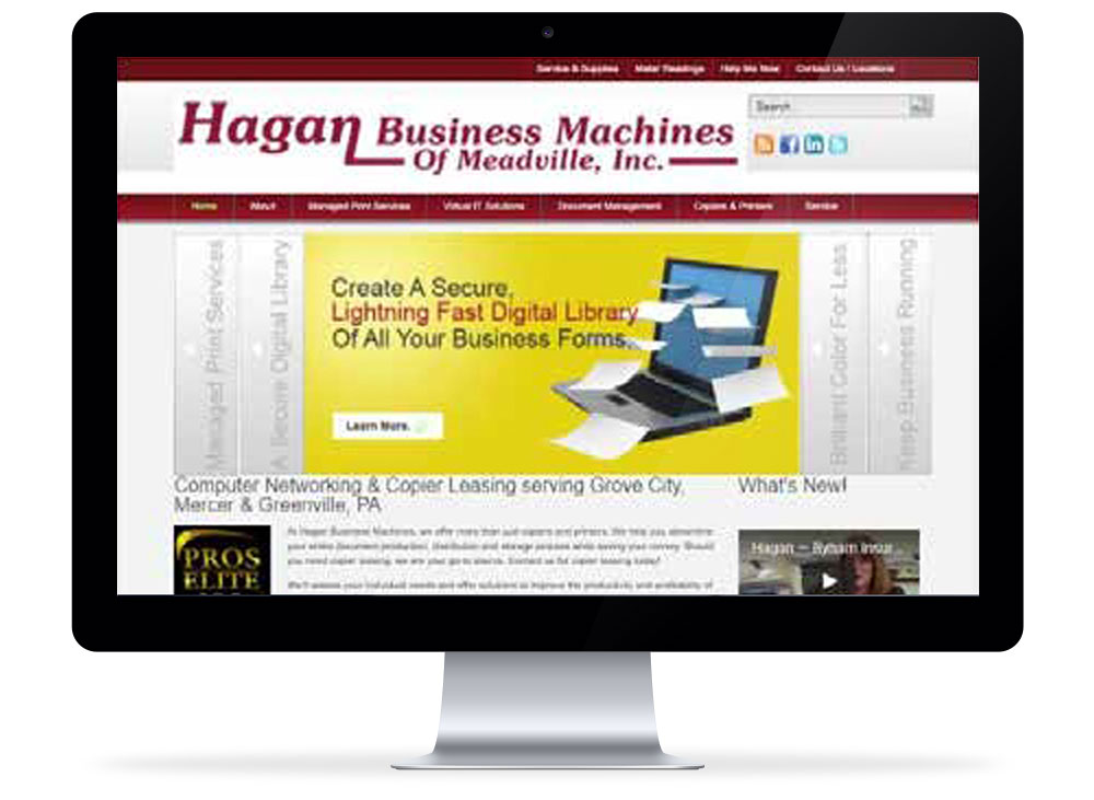
Old website performance

Navigation
Because of the high volume of content and multiple number of navigation ribbons, site visitors were quickly overwhelmed with choices making it difficult to quickly find what they were looking for.
Information
Additionally, the small fonts and long paragraphs made it hard for visitors to scan through the information, and ultimately yielded bounce rates (visitors who leave in under 3 seconds) over 80%.
6s
Loading time on 3g: Fair
24%
Est. Visitor Loss (due to loading time)
The site was not properly optimized for mobile screens which hurt them in search engine optimization, and because of high load time speeds, they were losing an estimated 24% of their traffic, which may have included potential business.
Old website comparative keyword performance
A comparison of Hagan’s website (Red) in relation to its competitors indicated a decline in keywords they were ranking for. What’s more, several competitors were either gaining ground or overtaking Hagan in keyword performance. Again, Hagan realized they may be losing business, because they were not being found in search rankings.

New website
A modern, yet easy to navigate design was utilized based on an analysis of the old site’s performance data. Hagan’s core services and products were prominently displayed using their brand colors, and navigation was simplified for all users to find what they needed quickly.

Navigation
The navigation was also designed to make it easier to segment new visitors looking for a solution from Hagan’s current customers who now had a dedicated client area and help material in the top right of the page.
Value Proposition
In addition, Hagan’s value proposition was given a prime spot, along with the other elements mentioned, above the fold of a standard monitor screen. This allowed new visitors to understand who the company was and what they offered within a few seconds of scanning the page.
Increased traffic
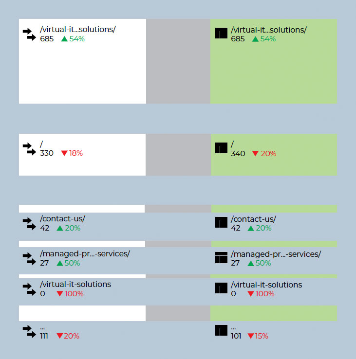
In a month over month comparison of the new versus the old site, increases were seen in the number of new site visitors as well as the amount of organic search traffic which jumped by 26.5%. Among other gains were a 50% increase in traffic to Hagan’s newest offering (Managed Services) and a 20% increase in traffic looking for Hagan’s contact information.

