Executive Summary
Why this case study may be relevant to you
Challenges
This project illustrates how Bull Moose Marketing was able to collaborate with their client to reorganize and update a historical, tourism-based website. Using scrolling animations, bold visual language and a unique layout, this redesign increased interest and engagement for this DMO’s website. By ensuring the website content was historically accurate, interesting and easily navigable, Bull Moose Marketing was able to help this DMO earn credibility and foster higher digital engagement.Situational Analysis
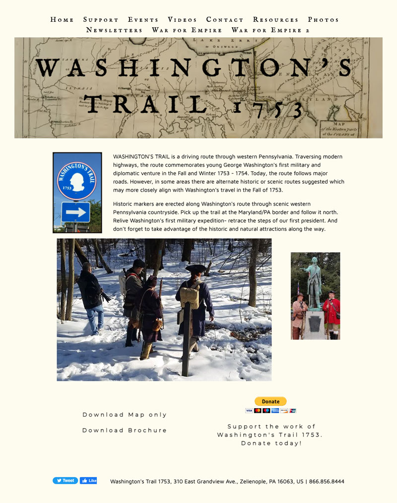
Washington’s Trail 1753 wanted to modernize their website to make it more visually appealing, easier to navigate and include a tourism component that their previous website did not have. The new website needed to serve two purposes: attract potential visitors and serve as a historical resource.
The organization’s previous website was confusing and outdated, with content that was not formatted for online users. Washington’s Trail 1753 understood that, in order to attract visitors, gain more online credibility and control their message, they needed to fully redesign their website. To accomplish this goal, Bull Moose Marketing worked with the client and important stakeholders, including Butler County Tourism and the National Park Service, to develop a new website with a memorable look, capability to speak to prospective visitors and support extensively researched historical content in an organized and captivating way.
The previous website had an outdated look, confusing navigation and did not motivate potential visitors to travel to the area.

Challenges
- Develop an optimized website that targets potential visitors and history buffs who are looking for historical information on the trail
- Organize client-provided historical content in a way that was easy to navigate and engaging for all website users
- Showcase destination information efficiently so website users could easily find it amidst historical content
- Create a well-planned layout to accommodate a large amount of content in a digestible format in order to connect with multiple audiences
Objectives
- Raise awareness about the trail
- Target potential visitors
- Create a website that acts as a digital historical resource
- Present content in an organized, engaging way
- Design simple navigation to help users easily find the content they’re interested in
Strategic Approach
- Collaborate with outside expertise to present accurate and targeted historical content
- Distribute content on the navigation bar to clearly define audience-specific content
- Create on-page navigation to help organize content and allow visitors to jump to relevant content
- Develop unique animation features to make content memorable
- Create a unique scrolling effect on the homepage to encourage further user engagement
- Build an interactive map of attractions to offer visitors a visual reference for historical events and landmarks
Creating an Organized and Educational Website Through Collaboration
Bull Moose Marketing’s website redesign allowed Washington’s Trail to improve user experience for website visitors, as well as present detailed, historical information in a digestible way. Adding animations and using a clear navigation menu meant that visitors were able to easily find the information they needed, regardless of their motivation for visiting the website.
The new website modernized the organization’s online presence, making it more appealing to potential visitors without alienating those looking for historical reference and context.

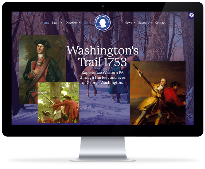
Washington’s Trail website homepage.

The homepage features a scrolling animation that immerses the user in the browsing experience and makes the site more unique and memorable. Another animation was added to drive the user’s attention to some highlights and landmarks along the route (watch video animation below).
Pages dedicated to historical events and context feature a navigation sidebar with anchor links that scroll the page to labeled chapters, breaking the content into more easily digestible sections (watch video animation below).
A page with a map of Pennsylvania that highlights all counties along the trail was added for geographical context. Clicking each of the counties scrolls the page down and inserts additional information and links to reference (watch video animation below).
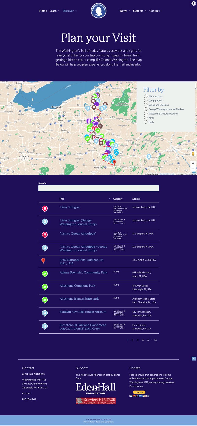
An interactive map of categorized amenities and landmarks was added to help visitors plan their trip.

